B2B Myth of the Week: Simply Having a Website Is Enough
by MGB2B

The Myth: Simply Having a Website Is Enough
The Truth: How Your Website Is Designed, Written, and Programmed Determines Its Performance
When was the last time you took a critical look at your B2B website design? In today’s market, B2B marketers simply can’t take a “one and done” approach to their web presence. Buyers have become acclimated to today’s standards. Content, searchability, user experience, aesthetics, and responsive design should be the drivers of your site layout. If your website hasn’t been updated in years, or if you haven’t fully fleshed out a recent redesign, we’ve put together a quick cheat sheet to get you up to speed.
5 Essential Building Blocks for B2B Websites
-
Killer Content
Creativity and persuasive insights don’t just work for B2C companies. There is a still a person on the other side of your website making purchase decisions every day. The content on your website has the potential to differentiate you from your competitors and lead your prospects further into your sales funnel. Make sure yours is compelling and directive. And more than anything, check your content for clarity, accuracy, and usefulness to your prospects.
-
Smart SEO & SEM
B2B marketers are getting savvier with search engine optimization and search engine marketing. And so should you. Since the rules are constantly changing, you can’t expect your site to produce results all by itself. Investing in an SEO/SEM specialist or using an agency to maximize your results based on cost efficiency is one of the smartest moves you can make. Use SEO and SEM to drive customers where you want them to go, then analyze their experience so you can make educated tweaks in the future.
-
Intuitive User Experience
Is your site easy to navigate? Where are your visuals placed? Are your call-to-action buttons easy to find? The answers to these questions can mean the difference between a click and a bounce. Your users want to be led, and your user experience dictates where you lead them. A successful user experience follows the natural eye flow pattern across a website. If your site feels clunky or fraught with stopping points, you’re more likely to lose users. Consider a redesign that leads your user to a purchase decision.
-
Engaging Aesthetics
The graphic design of your website has the power to elicit an emotional response as it is the first thing your buyer will see. Smart design works seamlessly with your content to convey a feeling, insight, or solution simply through imagery. You can set the tone right on the home page. The colors, fonts, photography, and illustrations you select can all affect those who visit the site. When done well, design can be a major point of differentiation from your competitors.
-
Responsive Design
Considering Mashable called 2013 The Year of Responsive Web Design, if your site isn’t by now, you’re woefully behind. Responsive sites “respond to” the type of device they are being viewed on, resizing to a more appropriate layout and view. (Think: desktop vs. laptop vs. tablet vs. smartphone). Why is this important? Because your buyers aren’t on their desktops all the time. If they are on the road or in meetings, and unable to really experience your site on their mobile device, you’re likely to lose them – and fast.
Online presence isn’t something that is created overnight. It takes time, research, and a budget to make a website worth having. Yet the initial effort up front can pay you back in spades for the long term. Your ROI can make it well worth it. So with this in mind, it’s worth repeating: when was the last time you took a critical look at B2B website design?
Continue ReadingThe Importance of Color on Your Website
by MGB2B
There are a lot of variables you need to think about when building a website. Layout, page flow, content, photo choices, CMS, hosting, the list goes on. But a major part of the design you need to keep in mind from the get go is the overall color scheme of the site. Below are a few key items to keep in mind when deciding on a color scheme for your new (or redesigned) website.
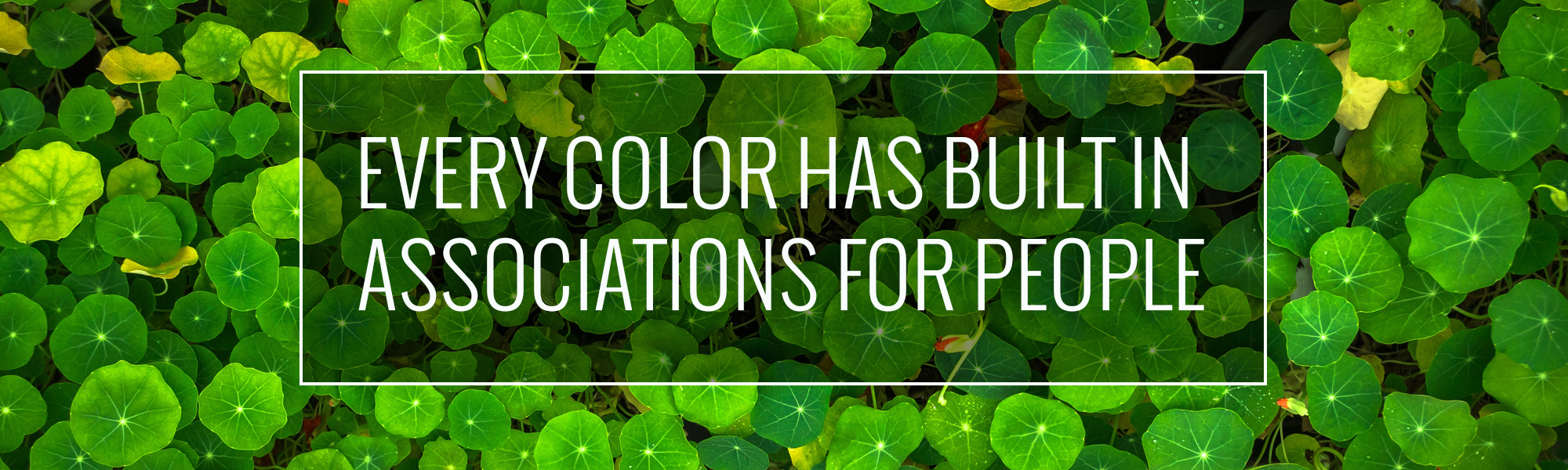
Color Psychology
Every color has built in associations for people. Those associations can vary widely in different cultures – but lets stick to the US for now. The use of color on your website helps set the mood for the user ‘s experience, affects how long they stay on your site, and helps drive them to action.
People associate blue with serenity, security and trust. Green can mean renewal, growth and nature. And red, the most eye catching of all the colors, can create feelings of action and danger. Colors not only have their own associations amongst cultures. They have specific associations with marketing due to the influence of the big multinational corporations we all know and love. See an interesting piece about this on ColorPsychology.org. These color associations should be taken into consideration with all design elements on your site, icons, call out boxes, and even the shades of color in the photography you are using.
Brand Consistency
Another major consideration: how does your website match up with your overall brand identity? Your brand identity should not just be taking a look at the colors in your logo. Sit down with all your marketing materials to see what a viewer of your website has possible already seen. Does the general color tone of your new website match the look of the email campaigns a client may have seen? Does it look similar to your print ad or Sell Sheets? If you spread all the work out on your desk, you should notice a theme. If not, and your desk now looks like a rainbow, then maybe you have other things than your website to think about.
Buttons and CTA’s
I have been talking a lot about color consistency. However, since rules are meant to be broken, the Call’s to Action and Buttons on your website are the perfect place to do it. You want your website to make sales, generate new leads, and in general perform well. If the items on your website that drive this blend in too much, you are missing an opportunity to convert viewers into sales.
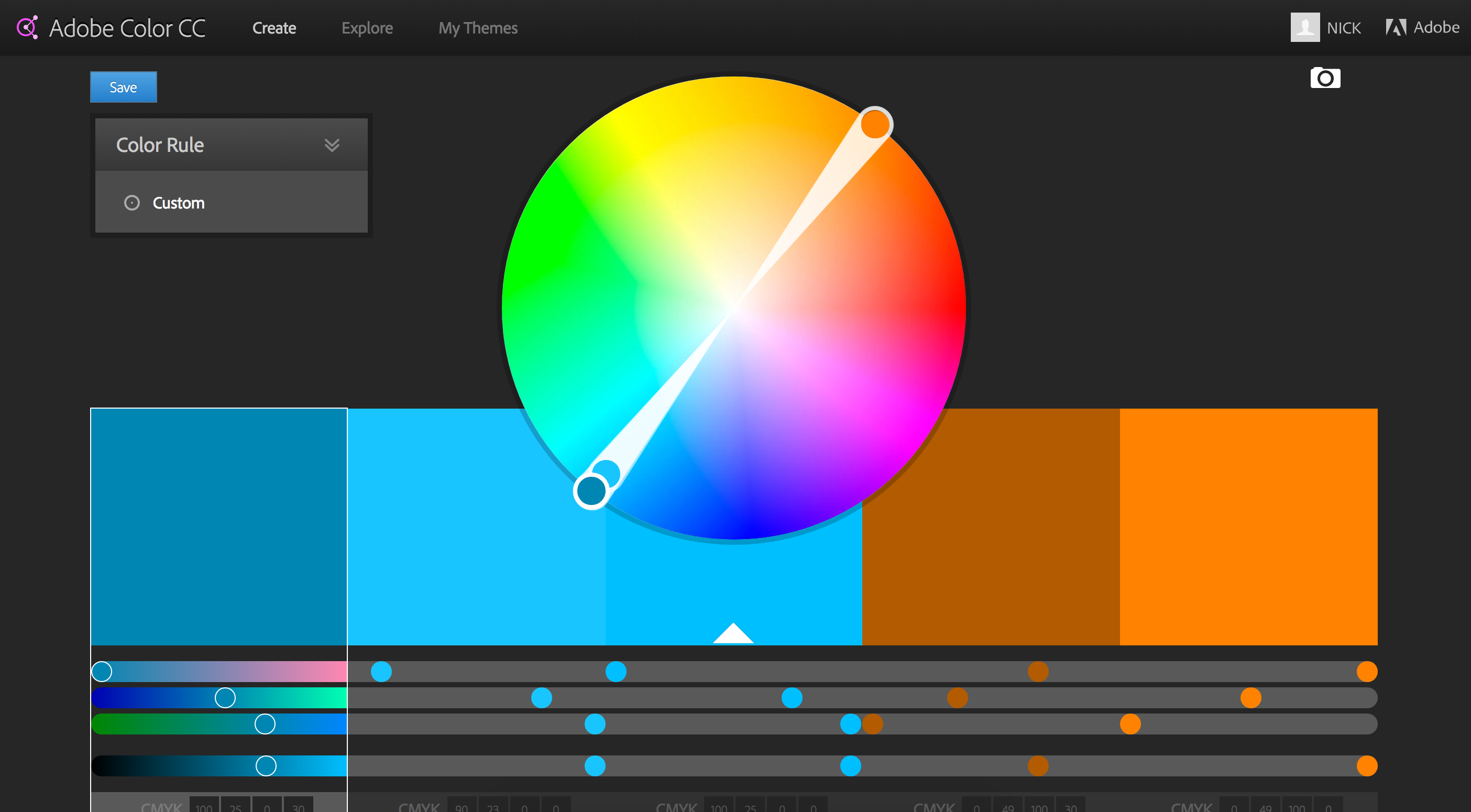
Here’s the tricky part: using color to create buttons that stand out, but don’t look gaudy. This can actually downgrade the quality of your brand. The easiest way to figure this out is through a tool that you may remember from elementary school art class – the color wheel.
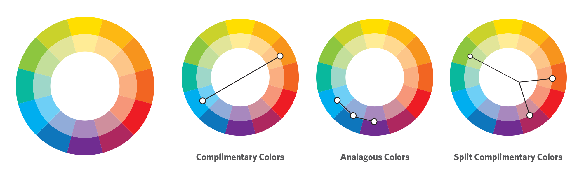
Your corporate color is your starting point. Then, I suggest you pick a either a complimentary, analagous, or split complimentary color scheme. This comes down to basic theory ideas. As you can see in the example above, a complimentary color scheme chooses the colors exactly opposite on the color wheel. Complimentary colors make a stark difference that will help your highlighted buttons really stand out. (Side note: beware of Red/Green combos that look very Christmasy if you are not careful). An analogous choice selects the colors directly adjacent to your brand color and is a much more subtle selection. And finally a split complimentary color scheme is a nice balance between the first two choices – it’s the two colors adjacent to your brand’s complimentary color. This helps make buttons and CTA’s stand out, but keep them from being jarring.
Complimentary Colors In Action
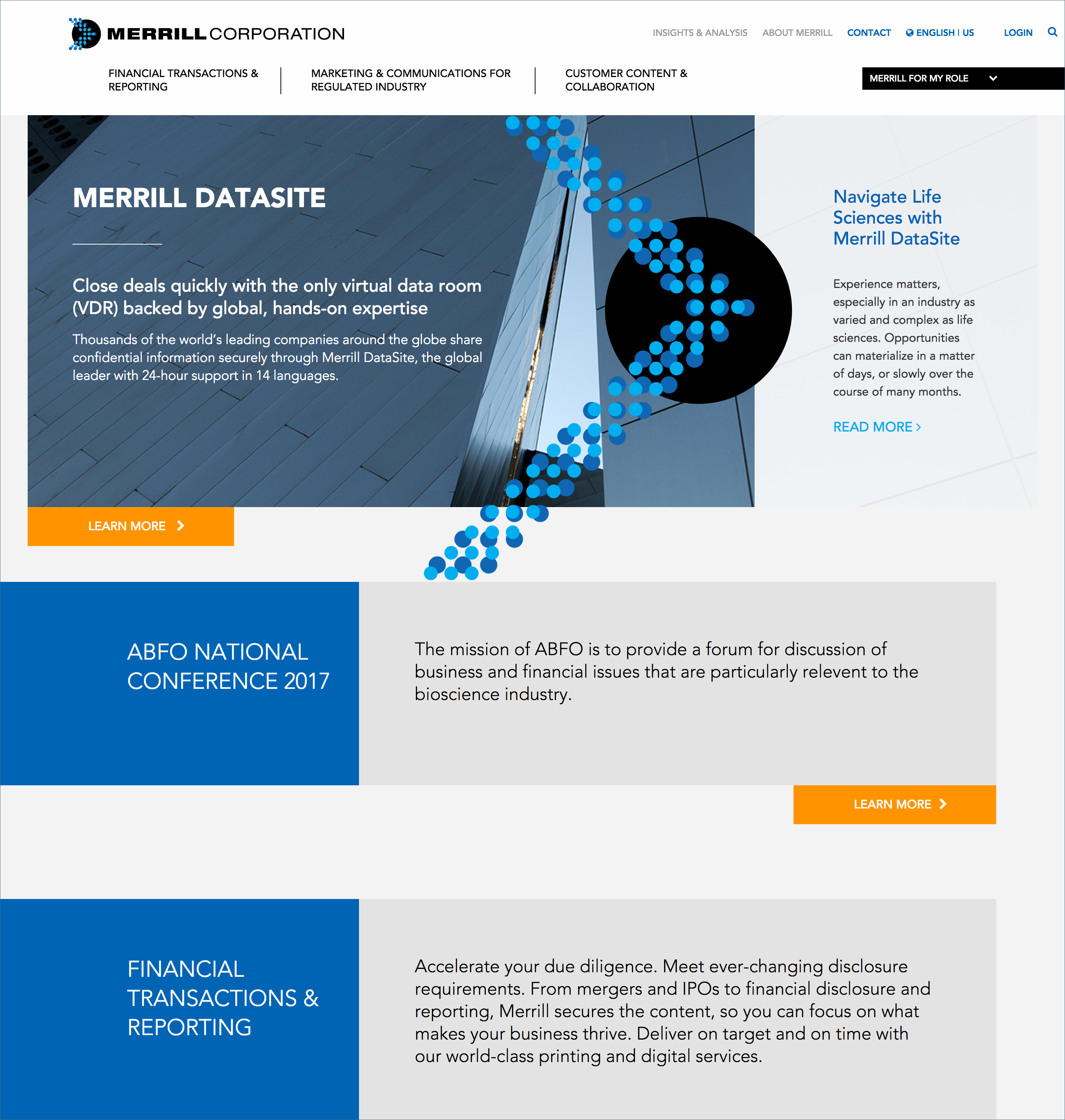
Merrill Corporation, the winner of the 2016 B2B Web Award. This is a good example of a site using a complimentary color scheme with blue as their corporate color and using orange as a highlight color for all their buttons.
In the end, there are endless directions you can take with the color scheme of your website. There are also lots of resources online to help with the process. At the onset of any major branding project, I often find myself turning to Adobe Color CC – great part of the Adobe Suite of products. This tool allows you to develop your own color schemes and to explore those of other Adobe users who have shared theirs. It is a great place to start.
[INFOGRAPHIC] The Impact of Manufacturing in the Northeast United States
by Vin DiGioia
While emerging markets worldwide have led to a manufacturing boon in some regions, on the whole, global manufacturing has seen relatively limited baseline growth. This is causing many to approach manufacturing in a new way, eschewing traditional viewpoints and developing new approaches to the practice.
Stateside, it’s no secret that American Manufacturing does a lot for the overall economy in the United States. From economic growth to job creation, the effects of manufacturing are felt in multiple sectors, across this great country of ours. This is especially true for manufacturing in the Northeast United States, where it contributes significantly to the GSP (“Gross State Product“) and overall workforce of many of the states in the region.