The Importance of Color on Your Website
by MGB2B
There are a lot of variables you need to think about when building a website. Layout, page flow, content, photo choices, CMS, hosting, the list goes on. But a major part of the design you need to keep in mind from the get go is the overall color scheme of the site. Below are a few key items to keep in mind when deciding on a color scheme for your new (or redesigned) website.
Color Psychology
Every color has built in associations for people. Those associations can vary widely in different cultures – but lets stick to the US for now. The use of color on your website helps set the mood for the user ‘s experience, affects how long they stay on your site, and helps drive them to action.
People associate blue with serenity, security and trust. Green can mean renewal, growth and nature. And red, the most eye catching of all the colors, can create feelings of action and danger. Colors not only have their own associations amongst cultures. They have specific associations with marketing due to the influence of the big multinational corporations we all know and love. See an interesting piece about this on ColorPsychology.org. These color associations should be taken into consideration with all design elements on your site, icons, call out boxes, and even the shades of color in the photography you are using.
Brand Consistency
Another major consideration: how does your website match up with your overall brand identity? Your brand identity should not just be taking a look at the colors in your logo. Sit down with all your marketing materials to see what a viewer of your website has possible already seen. Does the general color tone of your new website match the look of the email campaigns a client may have seen? Does it look similar to your print ad or Sell Sheets? If you spread all the work out on your desk, you should notice a theme. If not, and your desk now looks like a rainbow, then maybe you have other things than your website to think about.
Buttons and CTA’s
I have been talking a lot about color consistency. However, since rules are meant to be broken, the Call’s to Action and Buttons on your website are the perfect place to do it. You want your website to make sales, generate new leads, and in general perform well. If the items on your website that drive this blend in too much, you are missing an opportunity to convert viewers into sales.
Here’s the tricky part: using color to create buttons that stand out, but don’t look gaudy. This can actually downgrade the quality of your brand. The easiest way to figure this out is through a tool that you may remember from elementary school art class – the color wheel.
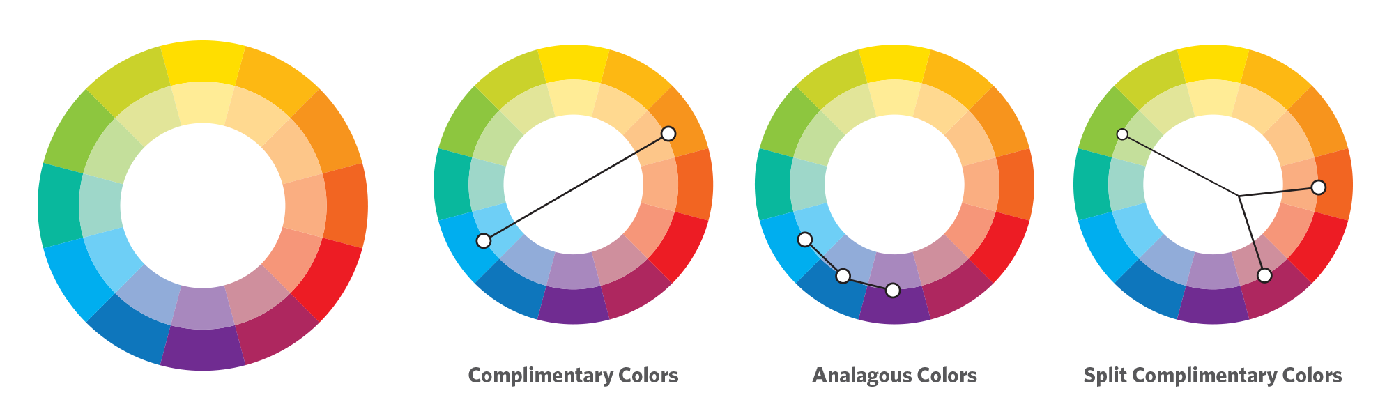
Your corporate color is your starting point. Then, I suggest you pick a either a complimentary, analagous, or split complimentary color scheme. This comes down to basic theory ideas. As you can see in the example above, a complimentary color scheme chooses the colors exactly opposite on the color wheel. Complimentary colors make a stark difference that will help your highlighted buttons really stand out. (Side note: beware of Red/Green combos that look very Christmasy if you are not careful). An analogous choice selects the colors directly adjacent to your brand color and is a much more subtle selection. And finally a split complimentary color scheme is a nice balance between the first two choices – it’s the two colors adjacent to your brand’s complimentary color. This helps make buttons and CTA’s stand out, but keep them from being jarring.
Complimentary Colors In Action
Merrill Corporation, the winner of the 2016 B2B Web Award. This is a good example of a site using a complimentary color scheme with blue as their corporate color and using orange as a highlight color for all their buttons.

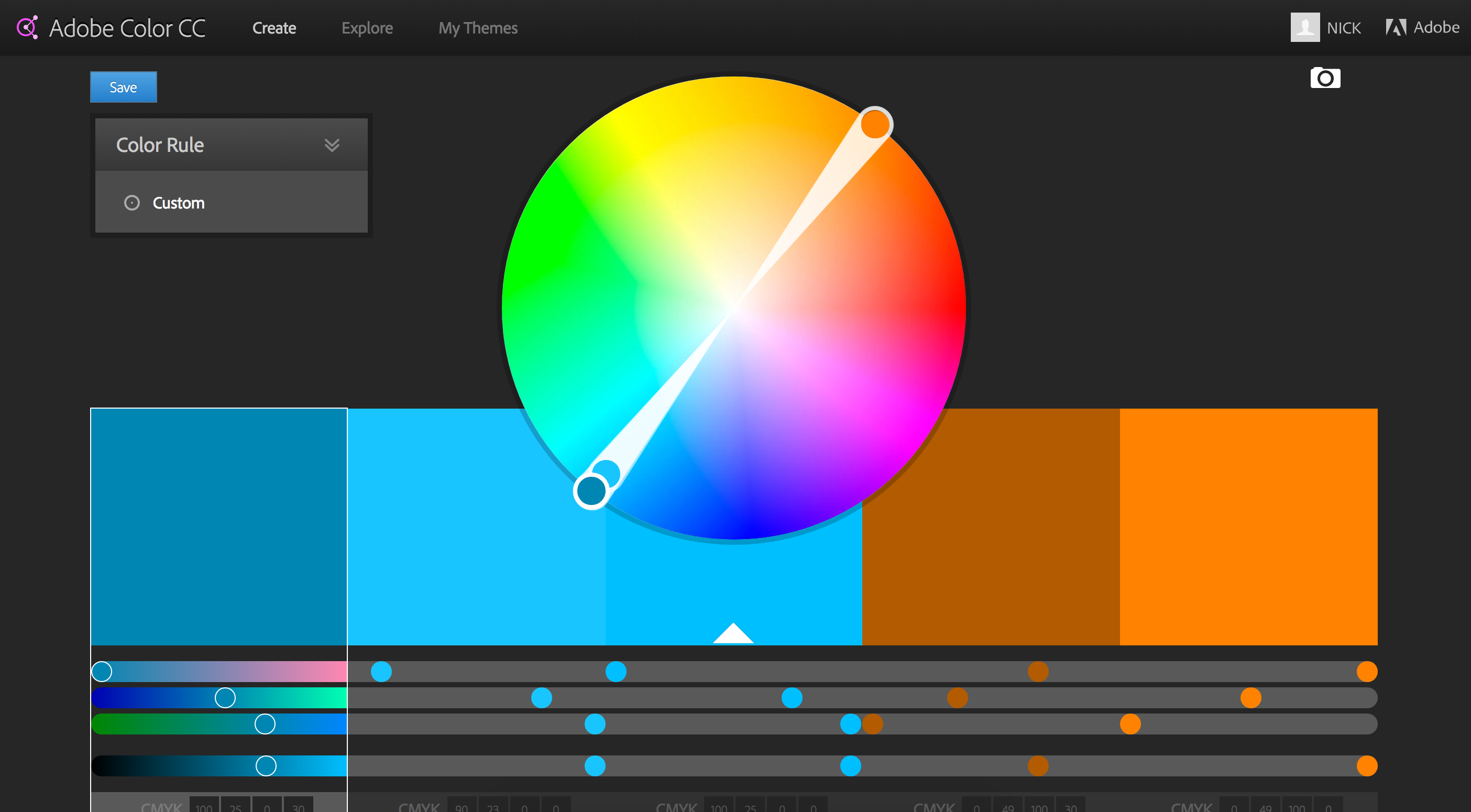
In the end, there are endless directions you can take with the color scheme of your website. There are also lots of resources online to help with the process. At the onset of any major branding project, I often find myself turning to Adobe Color CC – great part of the Adobe Suite of products. This tool allows you to develop your own color schemes and to explore those of other Adobe users who have shared theirs. It is a great place to start.