B2B Monday Myth: Emails Should Always Be Responsive
by MGB2B
The Myth: Emails Should Always Be Responsive
Truth: Not All Email Programs Are Ready for Responsive Design
More and more people are using mobile devices to access Internet content. When you look at the time adults in America spend online, you won’t be surprised to find that mobile usage is higher than desktop. So, it’s no longer a question of whether mobile marketing is important. It’s now all about mobile users’ habits and which content format (as well as the content itself) is most effective.
So what about responsive emails for B2B brands? Of course, a mobile-friendly website is essential, and in this case, responsive design is your best bet. (It has been for a few years now.) Responsive web design refers to a site’s ability to adapt its layout to different screen sizes and devices. You don’t want your prospects to be pinching and zooming on their phones to try to find what’s on your site. You might think that your marketing emails should be responsive too. It would allow users to engage more easily with your content, right?
Not necessarily.
Responsive emails are certainly ideal for some email programs. There is an issue, however: responsive design is not supported by all email clients. For example, some Android and Windows phone users will find their device doesn’t fully support media queries. This means responsive emails don’t show up on their phones, at least not formatted the way they should be. This can be incredibly harmful to your email campaign – an entire community of users is now unable to see your content as intended.
And when your prospects can’t read your emails, they are more likely to delete them.
The takeaway for you? Be careful about how you create your emails. You can craft and target your message perfectly, but the way it looks when it reaches your audience on their mobile device plays a huge role in whether they actually read it. A custom design created in a one-column format is usually the most effective route. Your prospects don’t all open email in the same programs, so make sure your designers are using the lowest common denominator to ensure that 100% of your audience is seeing your email correctly.
One day – and we anxiously await this day – all email programs will be able to handle responsive design. But until then, it’s best to play it safe.
Questions about email design or marketing strategy? Drop us a line.
Continue Reading
The Importance of Color on Your Website
by MGB2B
There are a lot of variables you need to think about when building a website. Layout, page flow, content, photo choices, CMS, hosting, the list goes on. But a major part of the design you need to keep in mind from the get go is the overall color scheme of the site. Below are a few key items to keep in mind when deciding on a color scheme for your new (or redesigned) website.
Color Psychology
Every color has built in associations for people. Those associations can vary widely in different cultures – but lets stick to the US for now. The use of color on your website helps set the mood for the user ‘s experience, affects how long they stay on your site, and helps drive them to action.
People associate blue with serenity, security and trust. Green can mean renewal, growth and nature. And red, the most eye catching of all the colors, can create feelings of action and danger. Colors not only have their own associations amongst cultures. They have specific associations with marketing due to the influence of the big multinational corporations we all know and love. See an interesting piece about this on ColorPsychology.org. These color associations should be taken into consideration with all design elements on your site, icons, call out boxes, and even the shades of color in the photography you are using.

Brand Consistency
Another major consideration: how does your website match up with your overall brand identity? Your brand identity should not just be taking a look at the colors in your logo. Sit down with all your marketing materials to see what a viewer of your website has possible already seen. Does the general color tone of your new website match the look of the email campaigns a client may have seen? Does it look similar to your print ad or Sell Sheets? If you spread all the work out on your desk, you should notice a theme. If not, and your desk now looks like a rainbow, then maybe you have other things than your website to think about.
Buttons and CTA’s
I have been talking a lot about color consistency. However, since rules are meant to be broken, the Call’s to Action and Buttons on your website are the perfect place to do it. You want your website to make sales, generate new leads, and in general perform well. If the items on your website that drive this blend in too much, you are missing an opportunity to convert viewers into sales.
Here’s the tricky part: using color to create buttons that stand out, but don’t look gaudy. This can actually downgrade the quality of your brand. The easiest way to figure this out is through a tool that you may remember from elementary school art class – the color wheel.

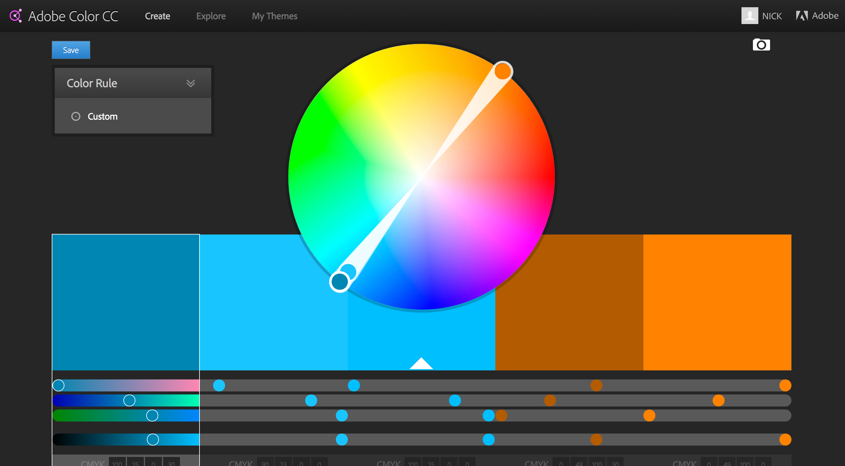
Your corporate color is your starting point. Then, I suggest you pick a either a complimentary, analagous, or split complimentary color scheme. This comes down to basic theory ideas. As you can see in the example above, a complimentary color scheme chooses the colors exactly opposite on the color wheel. Complimentary colors make a stark difference that will help your highlighted buttons really stand out. (Side note: beware of Red/Green combos that look very Christmasy if you are not careful). An analogous choice selects the colors directly adjacent to your brand color and is a much more subtle selection. And finally a split complimentary color scheme is a nice balance between the first two choices – it’s the two colors adjacent to your brand’s complimentary color. This helps make buttons and CTA’s stand out, but keep them from being jarring.
Complimentary Colors In Action
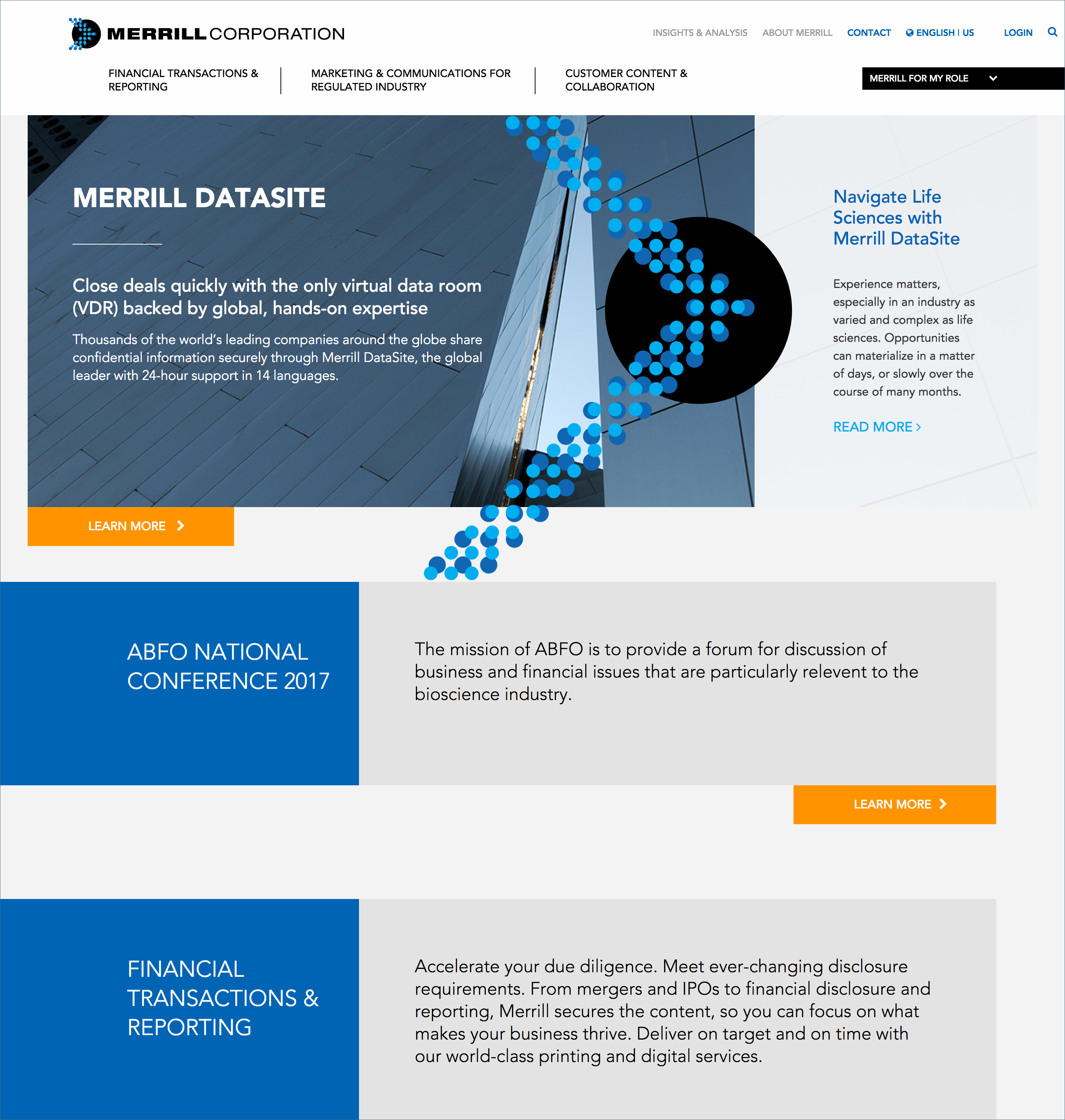
Merrill Corporation, the winner of the 2016 B2B Web Award. This is a good example of a site using a complimentary color scheme with blue as their corporate color and using orange as a highlight color for all their buttons.

In the end, there are endless directions you can take with the color scheme of your website. There are also lots of resources online to help with the process. At the onset of any major branding project, I often find myself turning to Adobe Color CC – great part of the Adobe Suite of products. This tool allows you to develop your own color schemes and to explore those of other Adobe users who have shared theirs. It is a great place to start.

Brand Management: Keep Your Creative Work Professional
by Ben Quinn
Pablo Picasso and his Cubism style of art is known throughout the world by the art illiterate and aficionados alike. His captivating work distorts reality and explores composition in ways that were not only ground breaking, but are considered by many as genius. What most people don’t know is that Pablo Picasso was a superb realist painter. It was only through years of experience, study, and practice that Picasso was able to achieve greatness by simplifying and breaking down his compositions into masterpieces. What does this have to do with buying logos, or brand management for that matter?
“Learn the rules like a pro, so you can break them like an artist.” – Pablo Picasso
We live in a world where boards of beautiful art stream into your smartphone accompanied by 140 characters or less. It’s easy to forget that truly inspiring, thought-provoking work is usually the result of a lifetime of dedication. With so many out-of-the-box website designs and crowd-sourced logos available, it’s easy to see why companies take this approach. Unfortunately, this also sets the low bar by which most brands are measured — and managed.

There are many high-quality compositions out there, but if there is no story, no personality behind your logo, then it’s just an image. It’s not representative of the hard working people behind it.
When asked, most companies claim their product is superior to their competitors’. But think about it: it’s through the learning process, mastery and challenge of real work that superior products reveal themselves. The same is true for the brand you put forth. Anyone can buy a logo, but truly refined brands know to employ creative minds that take the time to get to know their clients. Copywriters and designers that put in sweat equity get to know the core of their client’s abilities. These are the ones that take a brand from good to great. Hard work and dedication starts in research, then flows over to the next steps of brand management, and trickles into each and every project. The ultimate result? A thoughtful, cohesive brand.
So when choosing your approach to brand management, build a relationship with a marketing team that will put in the work. Only then will you be able to break the established rules effectively and stand apart from your competition.
Continue Reading

