Corporate Rebranding Done Right
by MGB2B
To rebrand an already existing company, especially one with some size, is a difficult task. You have many masters to please, and any mistake (real or perceived) will be viewed and criticized by lots of eyes. A recent rebrand that’s caught my eye is that of Dominion Energy, a company targeting businesses and residential customers throughout Virginia.
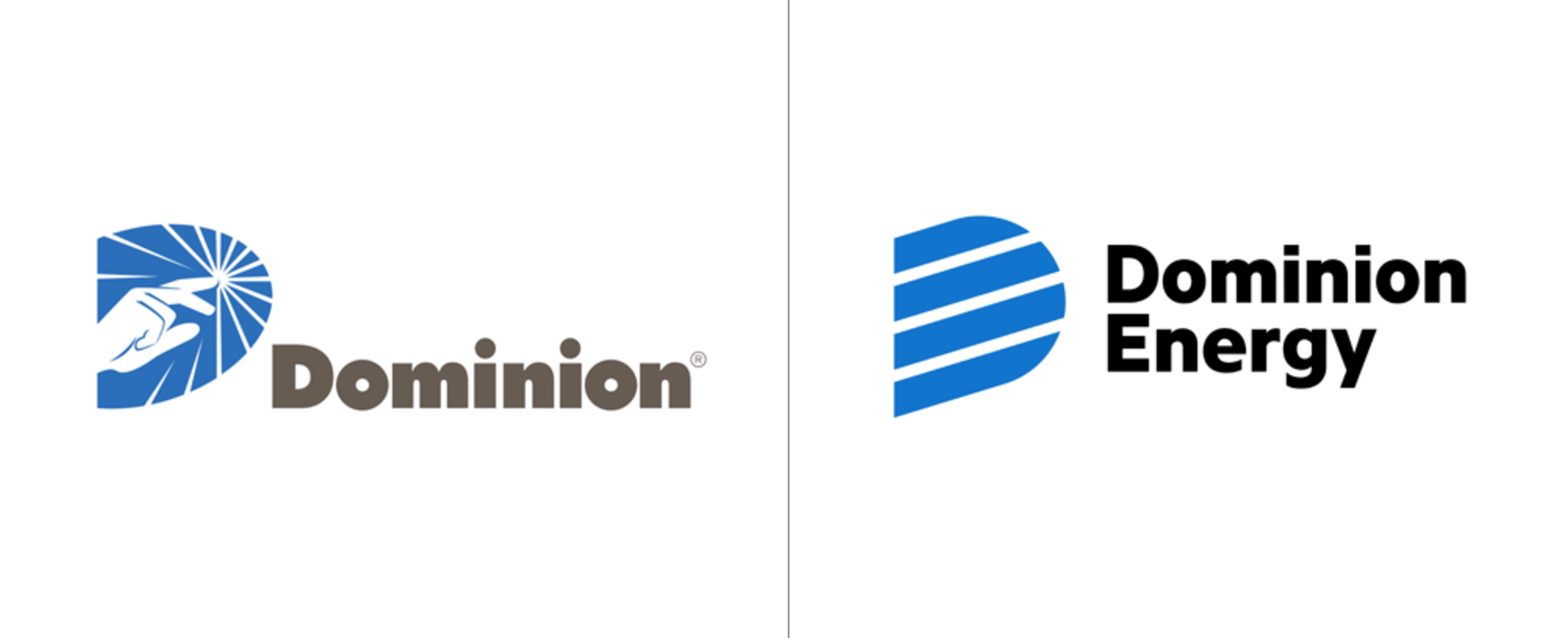
Take a look at a comparison of the old and new logos. You’ll notice that the proper choices were made to modernize the logo. I also applaud the removal of the hand, which looks suspiciously like the finger of God from Michelangelo’s “Creation of Adam” and could spark some backlash among certain customers.
Why It Works
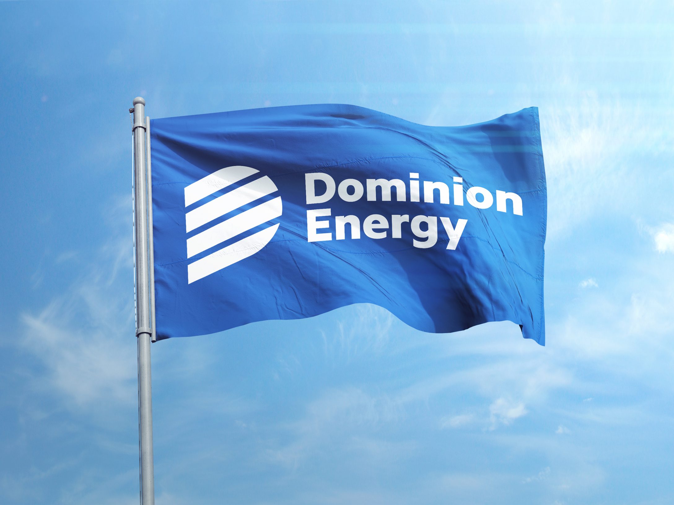
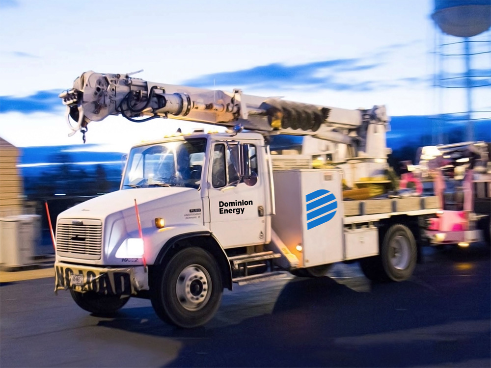
Overall, the redesign does a good job of portraying a company that is modern. And, through the icon shape and placement, one that is literally rising up. The logo itself and the overall application shown in the images that follow (from Chermayeff & Geismar) are by no means groundbreaking, cutting edge, or in my mind award winning. But it’s not always about creating a brand that meets these criteria.
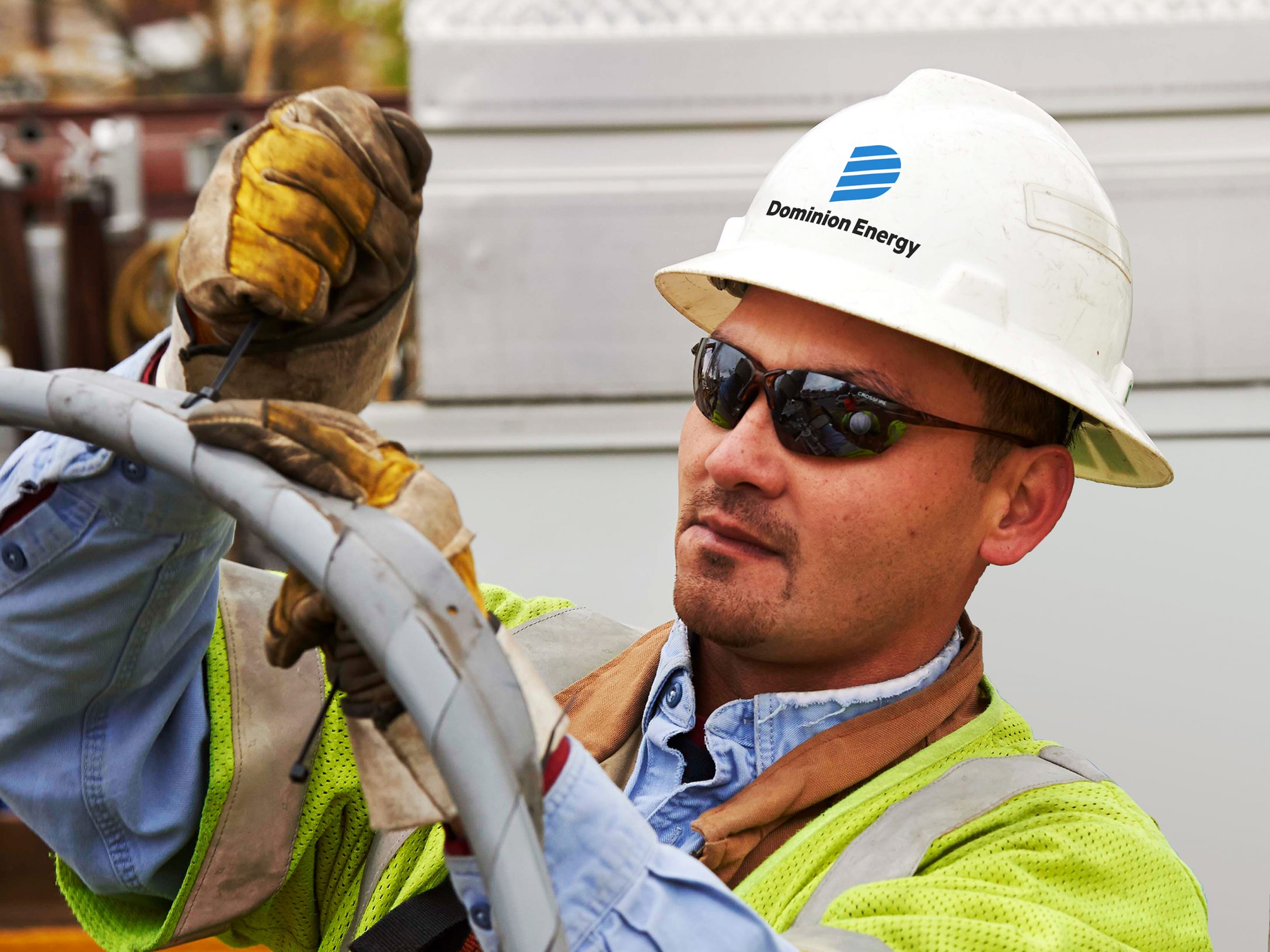
As a company that serves over 6 million customers in the B2B and B2C sectors, you need to keep a lot of people happy. Going too far down the road of pleasing one niche market with your rebrand will most likely turn off a good portion of another. This logo does a good job of appealing to all markets and bringing the brand to where it should be in 2017.