Update Your Logo, Keep Your Legacy
by MGB2B
We’ve worked with enough brands to know that suggesting a B2B logo redesign to your stakeholders can bring an onslaught of reactions. “What will happen to our brand equity?” “This has been our logo for 30 years!” “Who will recognize us?” and even “My uncle designed this logo.”
The thought of shaking up your image may seem risky, but let’s be honest. You can absolutely revitalize your logo without losing your legacy. Big companies do this all the time, and when done well, audiences don’t even notice. What they do perceive is a brand that seems current, despite how many years they’ve been around.
Let’s take a look at some of the big guys:
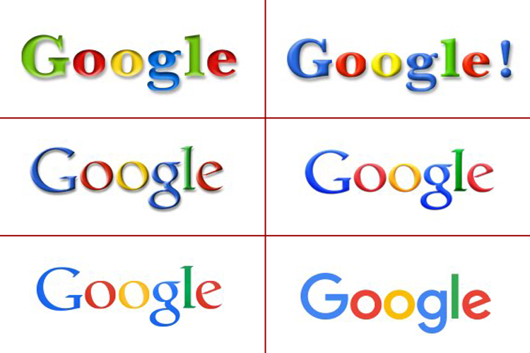
When compared to the logo used in its 1997 launch, Google’s current logo is drastically different. But we’re willing to wager you barely noticed the changes made along the way. The concept has stayed the same, and once Google landed on a color scheme in 1999, there’s been nothing but subtle changes since. A shadow lift here, a color shift there. Today’s logo is simple and clean — and supports Googles positioning: to organize the world’s information and make it universally accessible and useful.”
Coca-Cola
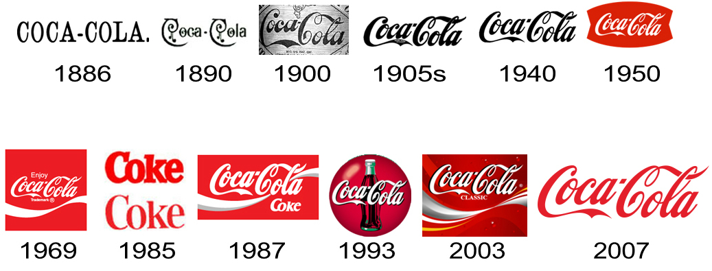
Coco-Cola has updated its logo a dozen times, but each one maintains its classic feel. (Well, except for that “New Coke” hiccup in 1985.) The logo’s iconic font is identifiable on its own. This is how, despite repeated updates, Coca-Cola retains its heritage while still feeling current — and is one of the most recognizable logos in the world.
Apple
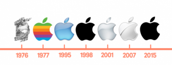
Apple’s first logo was a nod to Newton. The hand-drawn image was sweet, but not exactly suited for a future-forward tech brand. (It’d be nice on an artisanal cider, though). Once Apple nailed its shape in 1977, the only changes have been to the color and gradient. The 1977 logo was important because it represented the Apple II — the first home computer with color graphics. The next evolutions kept the clean lines and quirky attitude, but toned down the color to show a brand that’s bold and empowered to “think different.”
Yes, we know these are enormous brands with massive audiences. But smaller B2Bs can learn a thing or two from international brands — especially when it comes to something like a B2B logo redesign. If you’re worried your audience won’t recognize you, think again. Subtle changes, freshened fonts, and updated colors won’t lose your customers. Just the opposite. When done right, an updated logo nods to your past and shows you’re ready for the future. Just make sure you have a pro on your side to help you out.
Want more B2B tips? Follow us on LinkedIn.
Tags: b2b, B2B marketing, social media marketing